Portfolio
All Roads Lead to User Experience
The interfaces seen here are each culminations of the respective project's interaction design, targeted eLearning, information architecture, usability, and brand strategy. This may be more evident in some GUIs than in others. Some are more market-driven, some based on learning objectives, and some represent culture change. But the goal in all of them was to design for the user.
The documents further down provide a peek at some of the behind-the-scenes tools I have created. I've also included several persuasion games I had a hand in creating.
Logo designs round out the page. There are a variety of clients represented, from clinicians to kids to teachers to people on both ends of computer technology.
User Interface
 |
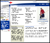
VA's Telemental Health is a clinical initiative at the Department of Veterans Affairs that reaches out to Veterans in remote locations to provide therapy for PTSD. The learning audience is comprised of mental health professionals and the content is focused on both clinical and procedural aspects of the program. |
 |
Bank Of America wanted to shift the focus of its public-facing brand toward the consumer (in addition to serving bigger business). This robust site packs most consumer services into an interface that accommodates most customers' banking needs. |
 |
A leading school district in Ohio, Perry Public Schools had recently standardized its district-wide approach to using technology. Part of this endeavor was to put a new face and fresh utility on its web site; one of the first pages redesigned was the high school page. With an active, supportive community, the pages needed to provided resources and information for parents as well as for students and teachers. And because the district's notable national standing was present in many forms of print collateral, the district wanted to reinforce this ranking online, a "brand strategy" of sorts. |
 |
The Chrysler Corporation contoured this site specifically for the concept car "Crossfire." The target audience was the enthusiast who appreciated the technology-rich features and engineering behind the car's design. This interface has several "sticky" elements to keep the user coming back: personalization, threaded discussions, and surveys. |
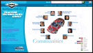 |
The Dana Corporation is a multinational company serving the automotive manufacturing industry. This crisp portal interface invited the Dana employee to learn about any department, or "community" within the corporation. This gesture reinforced the elements of a recent culture change in which each employee established ownership in the production and quality. In addition, the employee could access various applications and utilities through this site. |
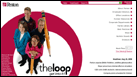 |
Penton established "The Loop" as an engaging communications tool to be used by personnel across all of it's creative, marketing and publishing divisions. Each week, a different group of Penton employees is featured in the loop. The unorthodox right menu was implemented because many employees returning to the site first checked to see which colleagues were pictured before beginning otherwise utilitarian tasks. |
 |
The Sherwin-Williams Automotive Paint Division is one of the largest in the country. The idea behind this eye-catching site was to appeal to the emotional and business standards of those in the automotive refinishing industry. The site serves to improve business and profitability for auto body repair shops. |
Documents & Distractions
Storyboard - This storyboard template is designed for maximum reach on eLearning, blended learning, or broadcast products: project managers, subject matter experts, designers, developers, and clients can all easily use this. Particularly so because I included a primer at the beginning. In addition to helping team members articulate content, this document has proven to be a very effective impetus for communication between team members!
SME Prep Tool - This tool helps experts articulate and chunk information from face-to-face presentations for re-purposing into instructional eLearning. One notable success with the tool was a PM software web-based training suite. In fact, the SME's felt so confident with their work that they chose to provide the voice-over for the final product. In this case, the amateur narration made the WBT more authentic.
Site Map 1 - This site map was for an informational site broken down by job role. The development team shared responsibility for populating the pages. A simple but highly effective practice is numbering the shapes on the site map: it turns it into an instant inventory tool! The wireframes shared this numbering system, too.
Site Map 2 - Here's an example of a site map I created in a form that noted IA Dan Brown sometimes uses. It moves away from the flowchart structure to something more organic. Structured like a mind map, the size of a shape indicates hierarchy, the grouping of shapes help convey how they're related.
Wireframe - As wire frames go, this one is fairly detailed. But the detail was not strictly for the designer, it was in large part for the client. Working with a business strategist, I conveyed relative positioning of onscreen elements to support the marketing strategy of this initiative.
Personas - These personas were created for those designing an informative web site supporting a recently-implemented learning management system (LMS) at the VA. These personas are meant to show the wide range of VA employees across a wide range of LMS user roles (i.e., a variety of LMS administrative levels). It was distributed to some who had not used personas before so there is a brief orientation at the beginning of the document.
Logo Standards - After a client dictated a logo design, I developed this standards document to ensure proper stewardship of the visual identity. Because the audience was potentially new to branding and logo use, the document has an educational tone, making it informative as well as regulatory.
Marketing Games - Encrypto and Matrixu were developed as persuasive pieces to deliver the user to key pages within a site. I developed the concepts and art directed these two games, working one-on-one with the Flash developers to bring them to life.
Logo Work
Here is a roster of logos that I have designed over the past several years. I tend to have a more elemental style and these designs represent a less ornate and more forward embodiment of the brand for the respective initiatives. More details accompany each when they're displayed fully.


